Strava Redesign
Web Design
Design explorations to simplify the information hierarchy of Strava's Web app
A Redesign of the Strava Web App
Why redesign Strava?
Strava is an app that tracks and motivates athletes to improve their athletic capabilities. I use Strava to track my cycling and hiking activities. I really enjoy the simplicity of Strava's Android app, but I can't say that simplicity translated to Strava's web app.
Here are a few examples why:
- Strava's 2 tiered navigation model buries information in different pages. For the longest time, I couldn't find my estimated power curve stats!
- The inconsistencies across the Strava Android and Strava web app causes me confusion. Why are notifications in the Dashboard as a tab on the web app, and an icon on the top nav in the mobile app?
- I'm always wondering: How can I quickly get my stats and progress?
As a Strava user and UX profressional, I'd say Strava's web app is ready for new design explorations! In this design exercise, I want to solve the user experience problems I encountered, and explore new ways to promote the value of Strava's Premium subscription. After all Strava needs revenue to keep providing its services to me :)
For the redesign, my goals were:
- Simplify the navigation and content model of Strava's web app
- Create more consistency between the mobile and web app
- Continue to motivate users to do physical activities
- Continue to promote Premium features to convert nonpaying users to Strava subscribers
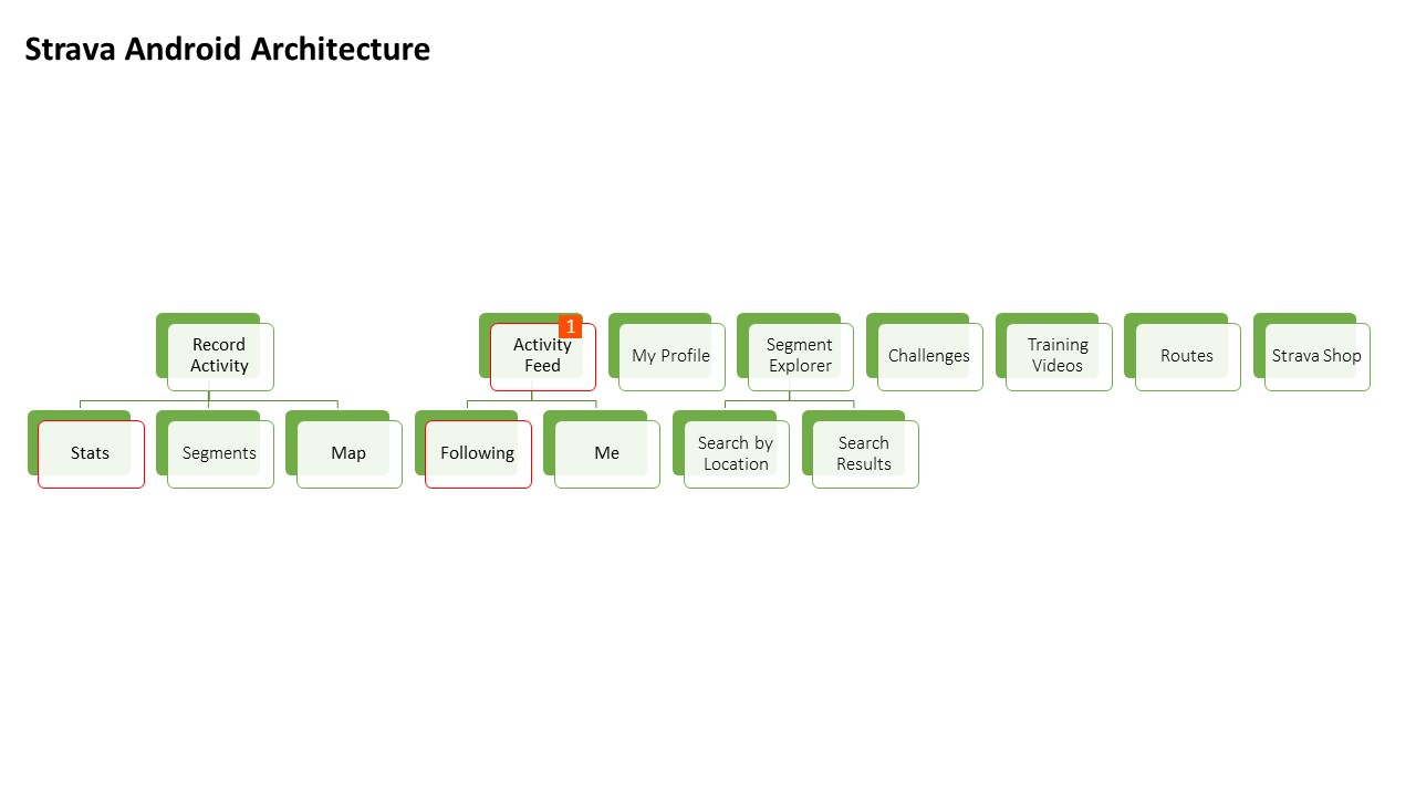
Mapping out Strava's Information Architecture
I started out my design process by mapping out Strava's information architecture to understand if I can simplify their current model.
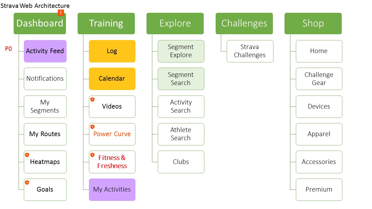
My initial analysis of their information architecture boiled down to these problems
Duplicate Pages - Why is there an activity feed under the Dashboard and My Activities under Training?
Many pages with similar functionality - Why is there a Segment Explore, Segment Search, Activity Search, Athelete Search, and Club search?
Strava's Android and web app have inconsistent information architectures
A Simpler Information Hierarchy
Before jumping into the designs, I listed a number of organizational changes and recommendations in the chart below based on my understanding of Strava's functionality. My focus was to combine pages with similar functionality.
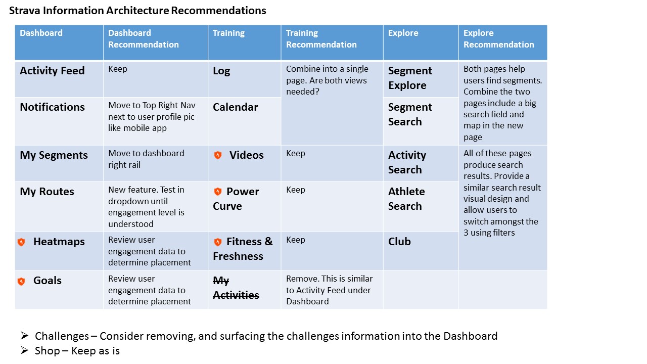
Disclaimer: One of the challenges with this type of redesign is I lack Strava's user engagement data to help with my design decisions.
Design Recommendations
Move notifications next to the user's profile icon so the placement is similar to the Android app

Combine different searches to reduce the number of surfaces users need to retrieve an answer
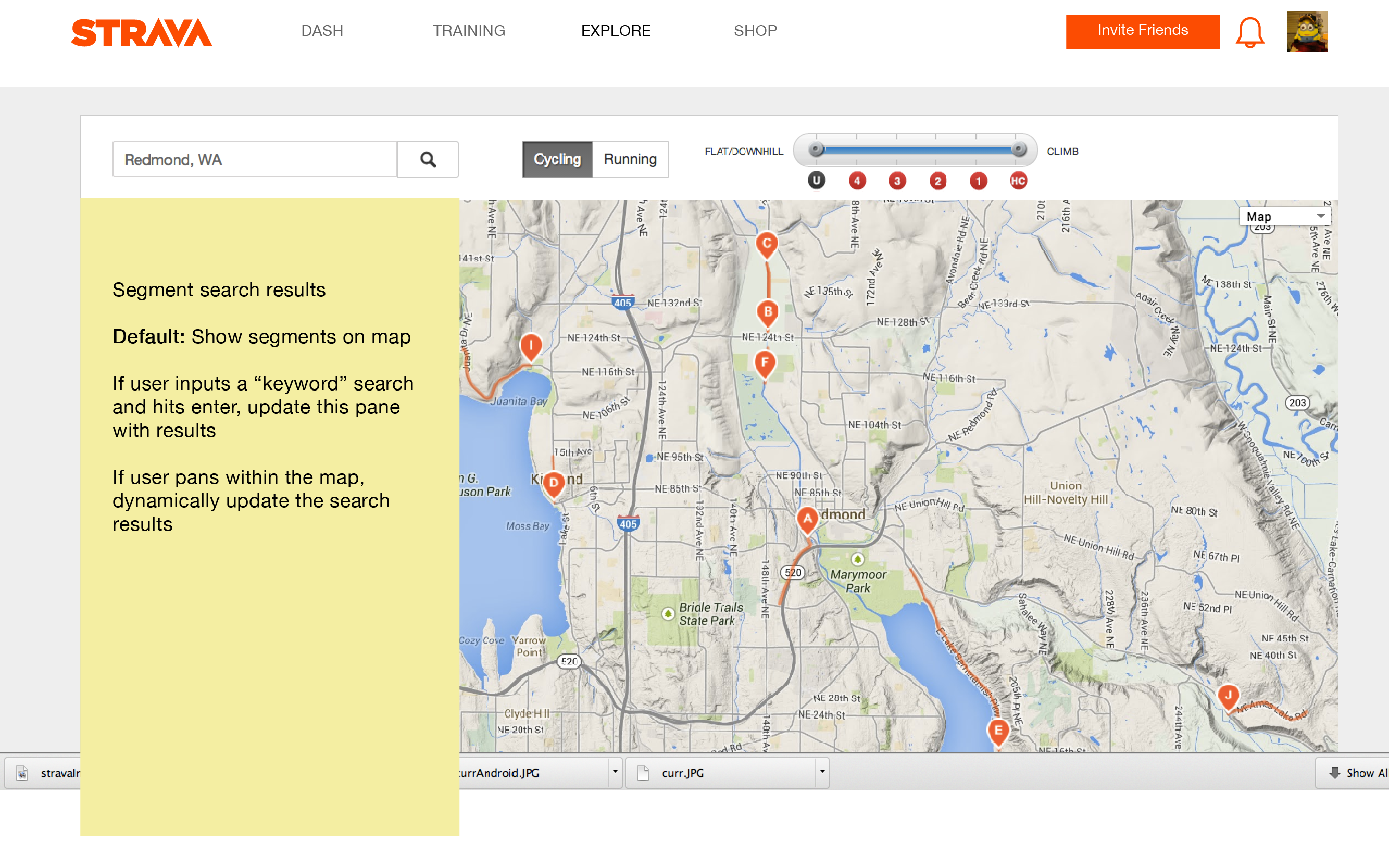
Design 1: A simple update to combine Segment Explore and Segment Search
wireframe example
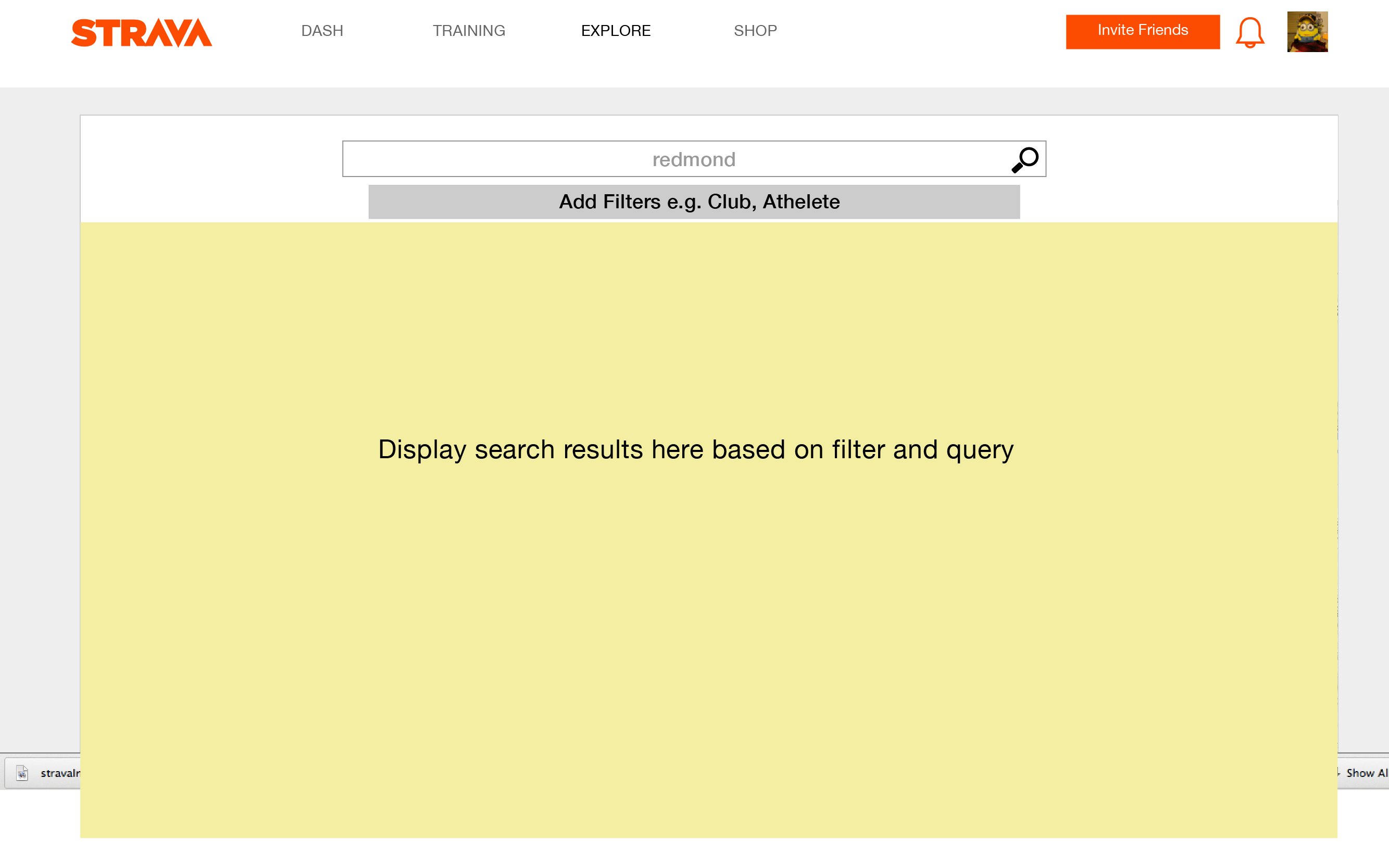
Design 2: Combine Segment Explore, Segment Search, Activity Search, Athelete Search, Club
A more aggressive approach to simplifying the navigation model is to combine all search activities into one Search box. A common web trend is to rely on a big Search box and filters to provided a single access point for users to answer their questions.
wireframe example
Redesign the Dashboard experience
What about the all important Dashboard? There are a few problems that really bug me.
- Many items are tucked away in the Dashboard like "My Segments," "My Routes," and a few premium features like "Heatmaps" so I rarely make use of these features.
- I keep wondering where I can find my stats
- I'm a premium member. What can I get out of my premium membership when I don't have a power meter or heart rate monitor?
One aspect I love about the Dashboard is the social stream. I really like seeing what other people are doing. The social aspect of Strava is also one of its main value props so I kept the social stream in all of my redesigns.
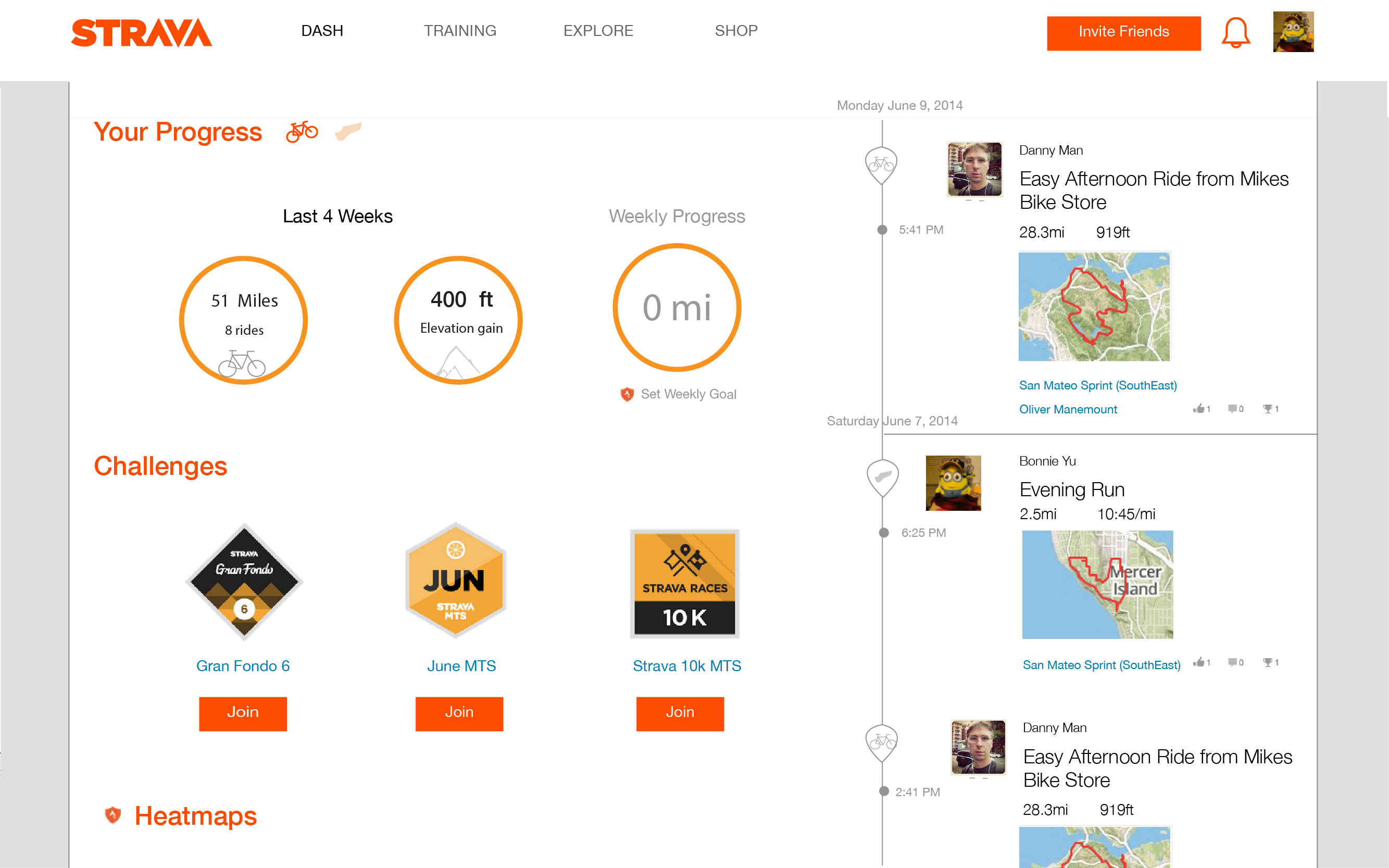
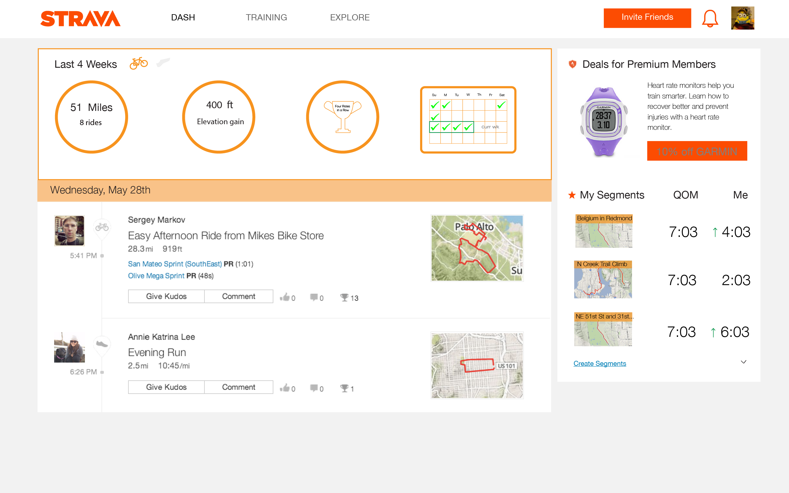
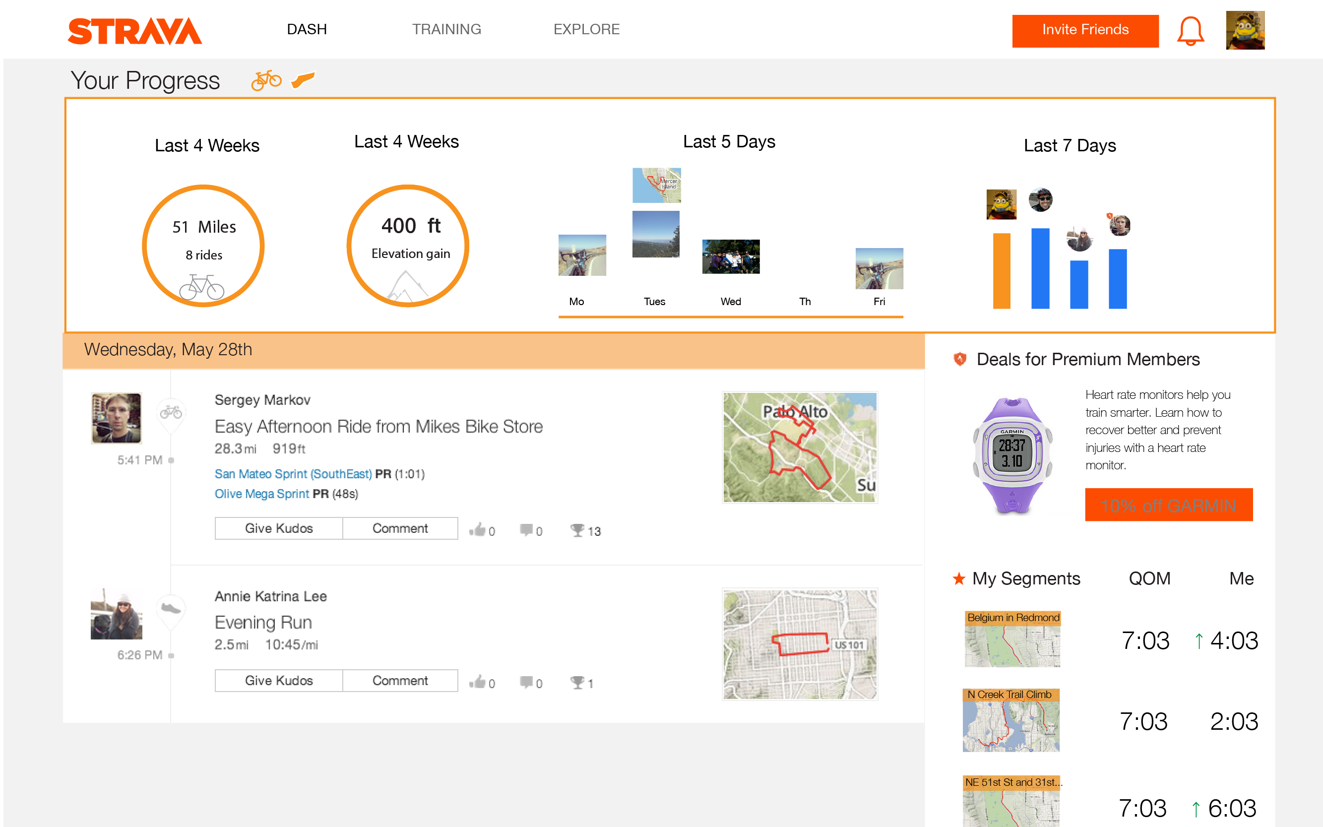
Design 1: Help me review my progress and understand the value of Strava's Premium membership
In this first design, I want to highlight two big changes.
How can I motivate to work harder? I added a quick stats view above the social stream. To motivate me to keep riding, I placed a small calendar to the right, so I can see how many days in a row I've ridden. In fact if I ride more than 3 days in a row, I gave myself a trophy :)
How can I get more value from my premium membership? I've noticed that a few of the premium features such as Power Curve and Fitness and Freshness requires additional gear. What if Strava and a company like Garmin can offer a discount on their heart rate monitors to Premium members? A heart rate monitor would make the Premium membership more valuable to Strava members. Of course, there's complexities in making a partnership like this - who would fund the discount - but it could be worth exploring if Strava Premium members with heart rate monitors are sticky.
medium fidelity design
Design 1a: Make my progress view more visual !
This is a quick iteration on design 1 where I add more images to the stats view to improve the aesthetics of the design.
medium fidelity design
Design 1a: Make my progress view more visual !
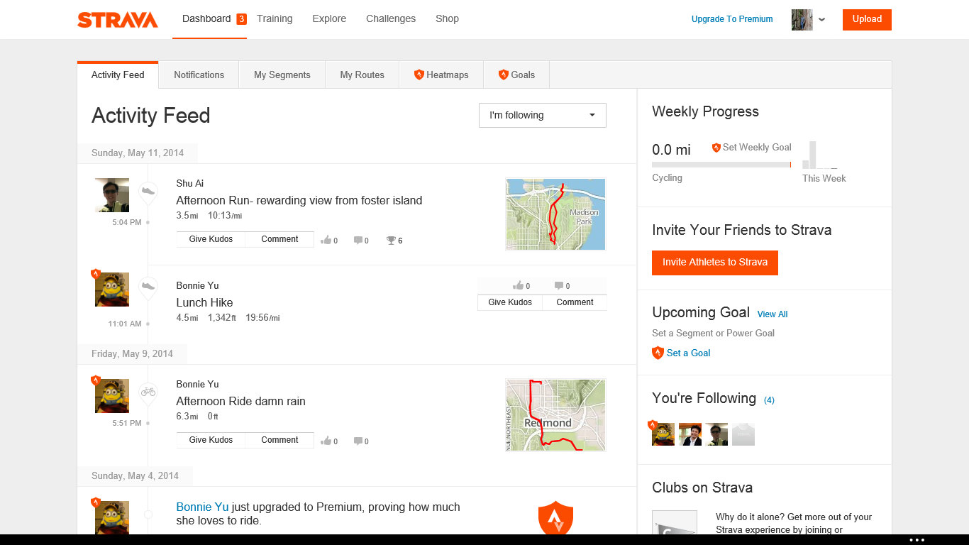
Design 2: Help Me Get an At a Glance View of Strava
Many of the above designs were incremental in nature, because I wanted to keep the social stream as it is. What if I moved away from the social stream? In this exploration, I reduced the width of the social stream to about 1/3 of the content module and moved it to the right rail. This immediately opened up new design space. Many news organizations today show a main module that has an "infinite" stream of content. I took a cue from this design and made a main content space.
Each row includes its own set of content. Now we can bring a lot of content that's been hidden in the tab menu to our new content space ! You'll notice I experimented with adding challengs straight into the dashboard. When users scroll down, Strava can also expose premium features in either the social or the main stream to convert users to the Strava Premium membership
medium fidelity design
I really like working on Design 2, because it opens up many new possibilities. The challenge here will be working with Strava's data to decide order and placement of the content in this stream.
Final Thoughts
At the end of the day good UX is about iterating and redesigning based on your user's feedback. Since the Strava web app is in production, Strava has the opportunity to do some experiments to get both user engagement data. A few potential data points to measure success include: time on Dashboard page, number of active customers over the next 30 days, conversion rate of premium subscribers. A/B testing is best with granular redesigns (change this font color to green instead of blue); these redesigns are too big to be so cut and dry but we can get a sense of the overall impact of the new designs. Combining both user research study to get verbal feedback and user engagement data can help Strava understand if these new designs help users get more out of their Strava experience!