teaLife
In Progress, Mobile App
teaLife is a mobile app that helps the tea community discover new teas in a delightful way. I designed and developed teaLife for fun. This is still a work in progress.
Try an alpha version at teaLife on your MOBILE device. This version is NOT optimized for desktop yet.
I'm interactive. Click!
inVision interactive prototype (work in progress)
Why teaLife?
I really enjoy tea, and love finding new teas to try. I couldn't find any Android app that helps users discover, acquire, and steep tea in a delightful way. Most tea apps have a menu of tea categories - "black," "rooibos," "herbal" - to browse. Part of these categories is based on oxidation levels while others are blends. What does "rooibos" or "chai" mean in terms of flavor? How do you know if you will like that tea? This type of tea organization makes it difficult for everyday people to find new teas. Tea Life helps users explore new teas through their flavor profiles.
How is the experience for Teavana's mobile app?
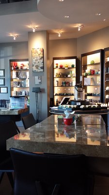
Teavana is one of the biggest tea chains in the United States. Teavana's app is one of the top apps that shows up on the Play Store.
-
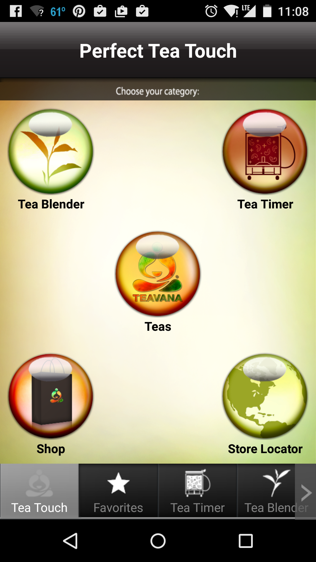
Home screen is very complicated
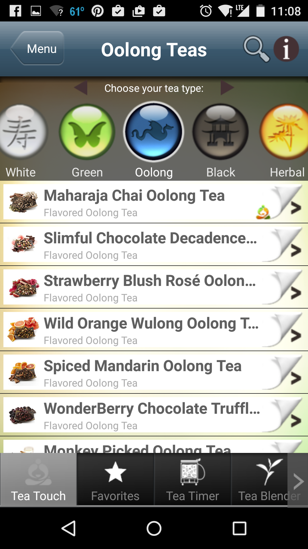
Tea discovery is based on oxidation
Teavana has a complicated and outdated tea app. On the home screen, there's two navigation areas: 5 circular buttoms and a bottom nav. This can be confusing especially because the two navigation has duplicate items.
On the tea discovery page, users can only explore teas based on oxidation levels. The tea page is hard to understand at a glance. It's clutted with menus and and icons. There's a top and bottom menu, and buttons on the app bar. The design is also very skeumorphic with page turn drawing for each tea item. I'm personally not against skeumorphic design. I believe it can be helpful when used appropriately. Page turning drawing is appropriate for a book app, but it doesn't reenforce tea concepts. This can distract the user instead of helping the user find tea.
Designing teaLife
teaLife simplifies the home screen experience by focusing on the discovery problem. teaLife is also designed to be approachable to everyday tea drinkers. Users find teas by "taste" filters such as "sweet" that can be understood by everyone. Another major difference between teaLife and other mobile tea apps is it follows a flatter design style. I use two colors primarily throughout the app. This makes it easier for users to focus on the content.
If you are on a mobile device, you can try an alpha version at teaLife. This version is NOT optimized for desktop yet.
Getting User Feedback
Getting user feedback is incredibly important in my design process. I interviewed users from Savrika Tea , a local tea shop in Kirkand, my friends, and known tea website owners such as World of Tea. The main goal is to see if users can complete the task of finding a tea, and if they understand how to work with the interface. The other goal is to get qualitative feedback from users on the feelings they have about the interface.
Users generally liked the interface. They found it refreshing that you can browse for teas by taste. Users also had a lot of suggestions to improve the usability of the app:
- Can you use more standard taste terms?
- Can you add countries instead of just categories and flavors?
- Can you add a favorite tea list?
This is all great feedback. How can I address this? A simple change could be to add a third section of country filters below flavors. Another simple design change would be test removing the "black," "rooibos" filters and includ countries only.
A few users expressed concerns about how well this would work in the desktop, and really wanted a desktop version. At the time of this writing, I designed this for mobile devices only. The intention is to use the website as a prototype to test the user flow. In my next iteration, I will look into either keeping this as a web app (and adding a desktop experience) or distribute it as a native app.